Today I’m sharing our classic navy-blue powder room project. If you’re looking for powder room design ideas or just love to see transformation projects (I always find them so interesting), see below for all the details!
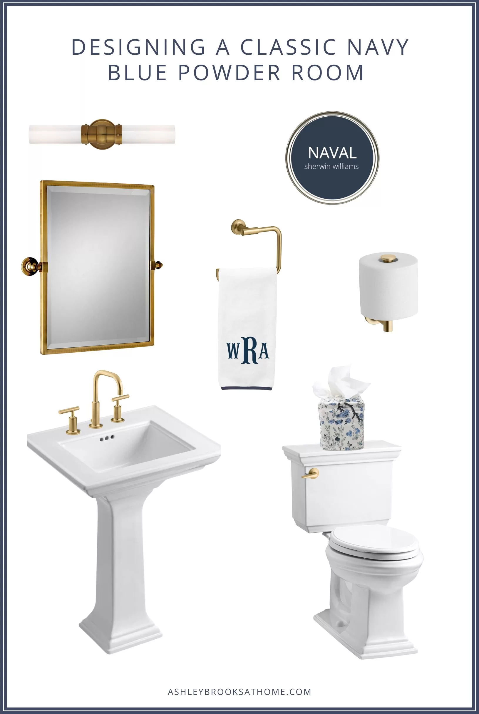
Design Board Details:
Sconce, Mirror, Paint Color, Towel Ring, Monogrammed Hand Towel, Toilet Paper Holder, Sink Faucet, Pedestal Sink, Tissue Box Cover, Toilet, Flush Lever
Designing A Classic Navy Blue & Gold Powder Room
When we first moved into our home, one of the first changes we made were some updates to our powder room. So far, we’ve made all the big changes: paint, plumbing fixtures, lighting etc… Now it’s just down to the details.
Since I’m not quite sure when the space will “officially” be complete (I tend to like to take my time with the details), I thought I’d be fun to share a progress post. Stay tuned for a before/after post!
Below you’ll find before pictures, inspiration photos, progress pictures and progress details. I’ll also step you through some design decisions I made based on my experience working in kitchen & bath design over the years.
Our vision: A modern spin on a classic navy-blue bathroom (in keeping with our historic row home). Considering we live just outside Washington D.C.; it feels very fitting for the area.
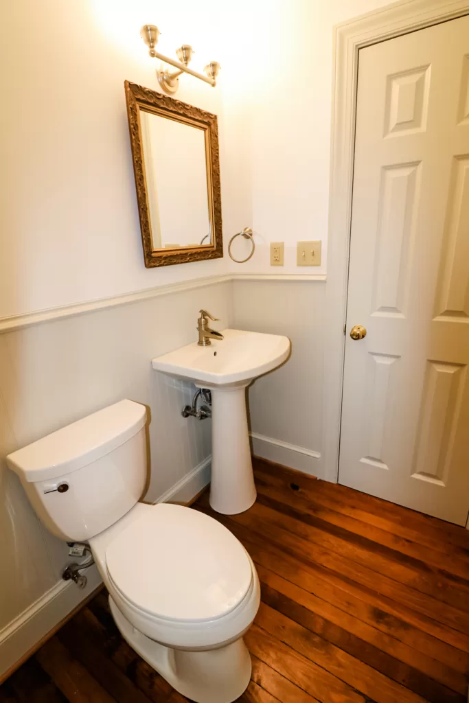
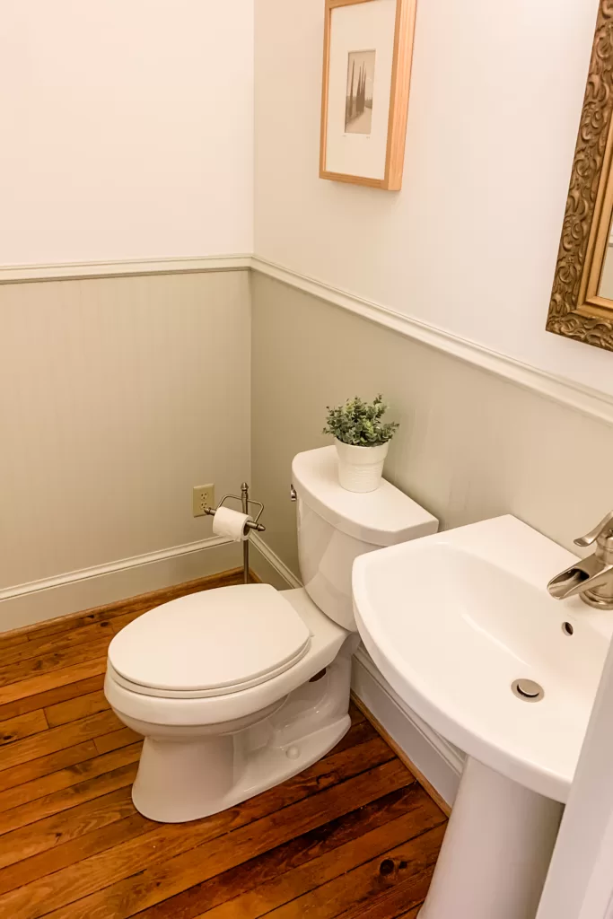
Our Powder Room Before
Here’s a look at the powder room before. The walls have now been repainted and pretty much everything has been removed except the toilet.
Inspiration Photos
Below are some inspiration photos I bookmarked prior to the start of the project.
Design Tip: Prior to all projects, I always try to hone in on a few key inspiration photos and pick apart all the details that spark interest. It helps me stay focused and confident in my decisions. Otherwise, it’s too easy to get sidetracked by shiny objects that don’t actually fit what I’m trying to achieve!
As you’ll see below, I love mixing traditional pieces with modern pieces. It’s a great way to preserve charm in an old home while bringing it up to date!
1. Navy Blue Vanity + Traditional Millwork
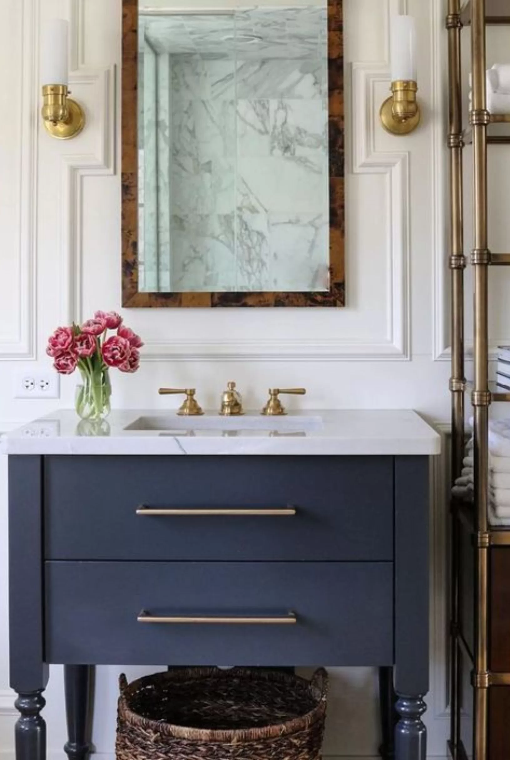
In this first photo, it’s all in the details! Leaning more traditional, the millwork, faucet and furniture vanity legs give the space a bit of charm. The rectangular sink, thick squared off countertop and long sleek cabinet pulls, take the space a bit more modern.
The mix of colors and textures really pulls this space together. The navy and gold color combo against the bright, white wall is classic & timeless yet modern & fresh. The burl mirror and textured basket helps warm up the space.
2. Dark & Moody Walls + Statement Console
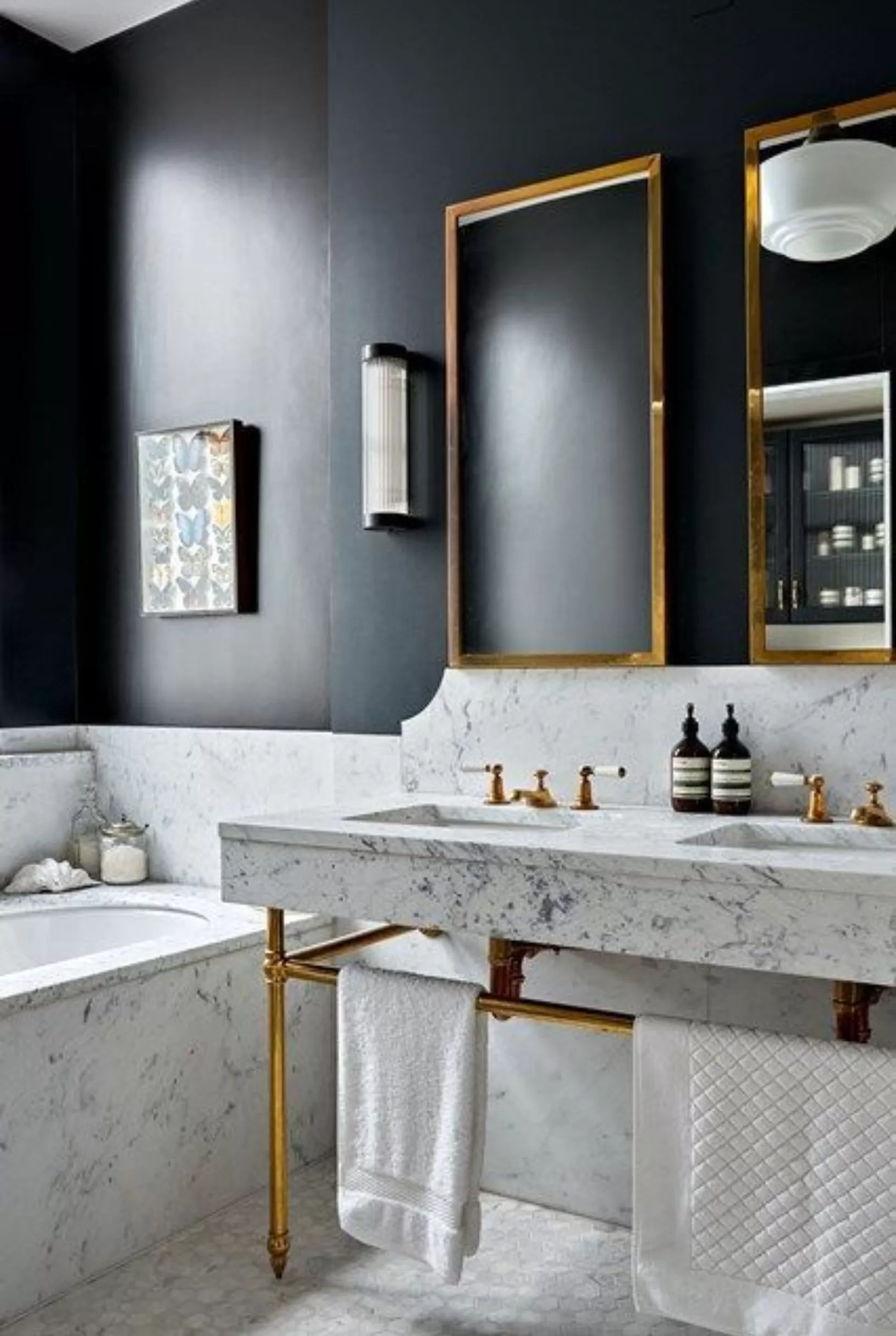
In this second photo, I absolutely love everything about the space, but it’s the console in particular that really catches my eye. The gold legs, the thick squared off natural stone countertop, the vintage faucets with white porcelain handles – it makes such a statement! If we had an unlimited budget, I would have done a console similar to this (on a smaller scale).
Design Tip: I find consoles to work really well in powder rooms. Not only are they statement pieces, but the open legs trick the eye to enlarge the space. Since many powder rooms tend to be quite small, they can really make a difference!
Just as the design in the first photo mixed traditional with modern, this bathroom does a great job of mixing the two as well.
Though I think this paint color may actually be black, it reminded me that I wanted a very deep, dark shade of navy. The contrast of the dark paint and white stone is just stunning! To me, the deeper, the darker, the moodier, the more elegant.
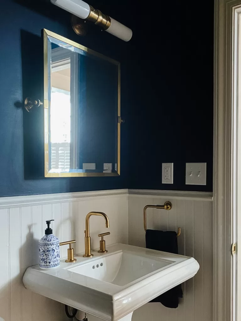
Our Powder Room: Progress Update & Pictures
Here’s a little overview of our progress so far. First things first on our list was the paint, then the plumbing fixtures, the mirror and the sconce…
The Paint
At the very beginning, one expense we thought we could save on was the paint. We painted every room in our house white except the powder room. We were lucky enough to have a little (ok, a lot!) of help from our family painting all the spaces white.
Next came the powder room and we thought, no big deal, it’s a small room. Compared to the whole house in white, this will be a piece of cake. Boy, were we wrong!
Between the dark color, the trim and the tight corners, it was no piece of cake! Now of course, no complaining here. It’s definitely a fun memory. It was teamwork! haha! – but, next time around, weighing the cost vs. the time spent and the quality of paint job, I’d probably just go ahead and hire a professional.
We did our best with the trim, but the white trim on the navy paint was tough. The tight corners really made it a challenge and the dark paint color required multiple coats, so the project dragged out for quite a while.
When it came to choosing the paint color, I wish I could offer specific recommendations, but truth be told we went with two discontinued colors. The navy was the exact same paint from my parents dining room (we color matched it to get it exactly the same). The white paint was a Sherwin Williams color I used in literally every project over the years that’s now discontinued.
If you’re looking for recommendations, though I haven’t used either color as of yet, I have heard good things about Sherwin Williams Naval for a navy-blue paint color and Benjamin Moore’s Chantilly Lace for a crisp, clean white. Those would probably be the closest to what we used.
The Plumbing Fixtures
Next came the plumbing fixtures. Luckily, my background working in the kitchen and bath design industry over the years came in handy! This was a fairly easy decision. We went with the Kohler Purist sink faucet (I love the cross-handle version too) & accessories (towel ring, toilet paper holder) in vibrant moderne gold and the Kohler Memoirs pedestal sink in white.
The Kohler purist been a best-selling gold bathroom fixture collection for a number of years. If you like the style, I highly recommend it. It’s great quality, the shade of gold is gorgeous (& pvd coated, meaning the color won’t change), and the style leans a bit more modern if that fits your taste and vision.
Gold can be a little tricky. There are a lot of different shades and sheens, certain fixtures can change color over time, the list goes on. If you don’t know a little bit about the pros and cons of gold first, making a selection can be a bit overwhelming. If this is a finish you want to consider, be sure to check out this post. I’ll step you though what you’ll want to know before making a decision.
Regarding our sink selection, the Memoirs has been a favorite for years. I remember specifying it for projects years ago. It’s still just as popular and in style today as it was back then. The decorative detailing resembles crown molding (a feature I loved in the first inspiration photo I shared) and the squared off shape gives it clean lines and a more modern edge.
related: 6 THINGS TO KNOW BEFORE CHOOSING GOLD BATHROOM FIXTURES
The Mirror & Sconce
Once we picked the plumbing fixtures, next came the sconce & mirror. I was after something that would bring together the modern lines of the Kohler purist faucet with the traditional design that was needed to be in keeping with our home. The Visual Comfort Graydon sconce did just the trick. The addition of the Pottery Barn Kensington Mirror pulled it all together. Even better, all the gold finishes were just about the same (or at least very close)!
Design Tip: If you’re looking to do the same, Visual Comfort is my #1 go to, to pull this off. They offer so many beautiful light fixtures that put a more modern, updated spin on classic, timeless design. I can’t recommend their fixtures enough. They partner with renowned designers such as Ralph Lauren, Aerin Lauder, Suzanne Kasler and more. They’re definitely investment pieces, but of the few that I’ve purchased, they’ve really elevated the spaces. We went with Visual Comfort for our dining room fixture as well.
Our Powder Room: Finishing Touches
Now it’s down to the finishing touches. Below are a few ideas I have in mind:
The Space Above the Toilet
At the moment we have a blank wall above our toilet. We had pictures taken of our family in the fall in a navy-blue color scheme, so a few of those would look nice in that space.
Another idea is to add a vintage framed print or two. Artist Jess Blazejewski has some great dark and moody ones!
Lastly, I also like the idea of portrait art. Perhaps a portrait of a historical fixture local to the area. We live in a 19th century home, so something in keeping with that time frame would be nice.
Here are a few collections of frames that I think would look stunning in a dark and moody space:
The Sidewall
We also have room on the side wall for a piece of furniture and more artwork. I’m thinking of perhaps continuing the artwork and mixing and matching frames to create a library vibe/gallery of sorts.
In terms of furniture, we could really use something with a lot of drawers and storage space. We live in a small home. Every square inch of storage helps!
I like the idea of doing a classic piece of furniture in a dark wood, but it’s really a I’ll know it when I see it kind of thing, so you never know! I see going more modern too.
I’ve been keeping my eye on local furniture boutique Random Home Harvest. If you’re local to the area and searching for unique pieces in a similar price range to Pottery Barn & Crate and Barrel, I highly recommend. They have beautiful furniture. I’m just looking for the right piece.
Last but not least, all the little decor pieces – a faux orchid, this tissue box cover (I recently wrote a post about this brand’s beautiful block print pieces!) and these monogrammed hand towels would look nice. We’ll see!
Stay tuned for more updates! It’s a work in progress, but it’s been a lot of fun dreaming of all the possibilities for the space. Can’t wait to see it all come together (hopefully soon!). Hopefully you found the design tips I shared helpful. I always try to turn past experiences and learning opportunities into helpful advice.
This post includes affiliate links. I may make a commission at no additional cost to you.